
The Gold silver ratio, as the name suggests is the ratio or the spread between gold and silver prices. Traders use the gold to silver spread chart to estimate how much gold costs, relative to silver.
In other words, the price on the gold silver chart will tell you the amount of silver it takes to buy gold. Many traders mistake the gold silver ratio chart to show some extra information. This can lead to the fallacy of trying to misinterpret the chart. The main reason for this is that traders are always on the lookout for that extra piece of information that can be valuable.
In effect, the gold silver ratio chart is primarily used to gauge the valuation of the two precious metals. This is more useful for precious metals traders. It allows one to hedge their bets, especially if they are primarily trading both gold and silver.
Such strategies are useful if you are trading the futures markets. Still, despite this, it is worth exploring and knowing how the gold silver ratio spread chart works. At best, it can tell the retail forex trader, which of the two metals is more valued.
Also, if a trader has positions in both Gold and Silver or plans to take up a position in both the commodities, following the gold silver spread chart can be helpful. The main takeaway is that you can assess the relative valuations of gold and silver. In this article, we explore the gold silver spread chart. You will learn how to construct one yourself and more importantly, how to interpret the data. But before going into the details, it is worth learning about the history of the gold silver ratio chart.
History of the gold silver ratio spread chart
Roman empire age
Both gold and silver are age-old commodities dating back before the creation of fiat money. The gold silver ratio took its roots during the Roman empire.
In fact, it is said that the Romans pegged the Gold silver ratio to 12:1. Meaning that it took 12 ounces of silver to buy an ounce of gold.
Bretton Woods agreement
Over the years, the ratio continued to hold, and it has changed its value over time. This is obvious, considering the various global events.
One such event was the Bretton Woods agreement in 1944. The United States and forty other nations agreed to peg their respective currencies to the USD. This also gave rise to the creation of the World Bank and the International Monetary Fund.
Under the agreement, the U.S. dollar was pegged to Gold, and the international currencies in turn were pegged to the U.S. dollar.
1971 onwards
However, things changed after President Nixon ended the gold standard in 1971.
As gold lost its prominence, so did the Gold silver ratio spread chart. But some continue to follow the gold silver ratio chart. Its value or the ratio continues to change over time, especially when accounting for inflation.
Still, it remains a valuable tool that can provide insights into trading these precious metals. The main purpose of the gold silver ratio chart is to essentially remove the US dollar from the equation.
However, considering that both gold and silver are traded and settled in USD, it is difficult to completely eliminate the influence of the US dollar.
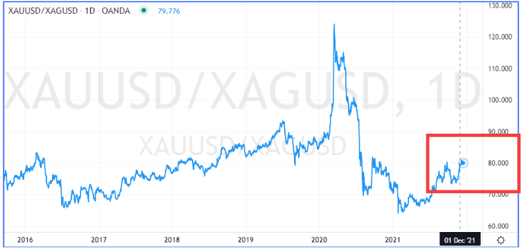
The gold silver ratio chart, in the current day, looks like this.
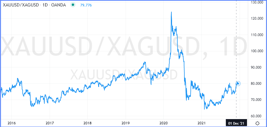
The gold silver ratio chart is not a set-and-forget type of tool.
Since it constantly reflects the changing prices of the underlying, one needs to view this chart to assess the changing ground conditions.
Components of the gold silver ratio chart
The gold silver ratio chart you see below, tells you that the value is at 80.
It can be interpreted as 80:1. What this means is that it costs 80 ounces of silver to buy an ounce of gold.
If one considers, the price of gold, assuming it is around $1807 and the price of silver at $ 22.61, then using the ratio, we get the following:
| Price of silver x the ratio | = | Price of Gold |
| $22.61 x 80 | = | $1808 |
The gold silver ratio chart comprises just two key components.
- Price of gold
- Price of silver
Traders can construct the spread chart by using the formula of XAUUSD/XAGUSD (depending on what trading or charting platform you use).
The charting platform will automatically create the spread chart for you, as can be seen in the previous slide. The above chart was created using Tradingview.
The regular MT4 trading terminal unfortunately does not allow for plotting spread charts. This limitation also applies to other standard trading terminals such as cTrader or even Ninjatrader.
The number 80 can be interpreted as a multiple for silver prices.
There are times when the gold silver ratio surged as high as 100. This meant that gold was valued 100 times over the price of silver.
One could further interpret this data by saying that gold is 100 times more valued than silver.
In recent decades, the gold silver ratio fell to lows near 31 in 2011.
Still, the important point to remember is that gold prices are always higher than silver prices. It would be an interesting time when one gets to see silver being more valuable than gold.
Using and interpreting the gold silver ratio chart
So far, we have learned what the gold silver ratio chart is and how it is constructed.
We know that there is nothing magical about the Gold silver ratio chart. The number or the price you see from this chart is merely the ratio or the multiple between silver and gold. Now comes the question of how to use and interpret this data.
First and foremost, if you were a precious metals trader, you would be interested in trading both gold and silver.
However, the trick is to find which of these are overvalued or undervalued. Based on this information, traders can then pick their bets. An undervalued instrument is more likely to outperform compared to buying an instrument that is already overvalued. The age-old adage of buy low, sell high comes into play here. Thus, precious metals traders are able to pick one of the two or even hedge one against the other using the gold silver ratio chart.
While the primary usage of the gold silver ratio chart is for finding the relative valuations, it can also give some insights.
However, these insights may not hold true all the time. Therefore, traders need to apply their discretion and consider their risk tolerance when applying the methods outlined in the next section of the article.
Since both gold and silver are highly volatile, the prices can fluctuate back and forth. Depending on the lot size that one trades with, this can lead to high drawdowns as well. Hence, traders need to be extremely careful when using the gold silver chart to assess the direction of the respective commodities.
Can the gold silver ratio chart foretell prices?
One interesting observation to note is a comparison between the gold silver ratio chart and the price of gold itself.
Take a look at the chart below.
On the first part, we have the price of gold, while on the lower chart, we have the price of the gold silver ratio. In the first instance, notice how the gold silver ratio chart drops to a relatively new low in February.
At this point, you can see that gold made a modest dip before making a small pullback to the upside. But following a breakdown of prices below this level, you can see eventually gold falling to a low in March.
Similarly, in April, we see the gold silver ratio chart making a high. Following the price action in gold, we see that this coincides with a low in gold prices. If we take the previous resistance area, you can see how the price breaks past this level. Following this, we see gold prices rising and making a recovery.
While the above examples are merely for illustration, it shows one of the ways the information from the gold silver ratio chart can be used. Traders can of course use this information further and conduct their own technical analysis in order to detect what gold prices could do. The gold silver ratio chart also tells you how it tends to foretell what gold is likely to do. Similar methods could be applied to study the price action in silver markets as well.
Understanding the extreme readings in the gold silver ratio chart
Following up on the previous section, traders should also pay attention to the levels in the spread chart.
An extreme reading can potentially suggest a market reversal. This is often true when looking at indicators such as this.
Similar examples such as this can be found in the CoT or the Commitment of Traders report. When there is an extreme reading, it often foretells that the market is very bullish or bearish.
In the context of the gold silver chart, an extreme reading can tell you that either gold or silver is extremely over or undervalued. This can then tell you which instrument to focus on.
Applying your technical analysis to the commodity in question, you can then time the entry of your trade.
We should mention that you should not add any technical indicators to the gold silver ratio chart. It may be tempting for some traders, but this is not how a ratio, or a spread chart is used.
A spread chart is simply an indicator by itself that tells you what is happening with the underlying market.
By adding technical indicators to the spread chart, you would end up making it a lot more complex that it actually is. This can also lead to false analysis bias that can be detrimental to your trading.
Broadly put, when the gold silver ratio is rising, it can mean one of two things, but just one interpretation.
- Gold prices are rallying faster than silver
- Silver is depreciating, relative to gold
On the other hand, if the gold silver ratio is declining, it can mean one of the following:
- Gold prices are falling faster than silver
- Silver is appreciating, relative to gold
Hence, consider the price of gold and silver when interpreting the gold silver ratio chart.
Trading with Gold silver ratio chart – Concluding remarks
In summary, the gold silver ratio chart is one of the oldest ratio charts that we know of.
While this is primarily a tool to assess the relative valuations between gold and silver, it can also be used by retail traders when it comes to CFD trading. There is a certain level of risk when using this methodology. Hence, traders should not use this information in isolation. Always look to other tools such as technical indicators as well as the fundamentals to confirm your bias.
In quite some cases, you will see that the market information tends to lag. This can lead you to lose out on potential trading opportunities. If you are using the gold silver ratio chart, then this is a tool that you need to keep an eye on, constantly. To successfully utilize the gold silver ratio, one needs to have a good level of understanding of how the precious metals market works. This means having prior knowledge about the metals landscape as well as looking at the respective reports for the two metals in question.
We should once again reiterate that the gold silver ratio is not a magic bullet that will lead you to success in trading gold or silver. At best, it is a tool that is used to assess the relative performance of both the commodities in question. One should also have realistic expectations.
Many traders who do use the gold silver ratio chart believe that it can give them the market edge. But bear in mind that it is no secret and there are many other traders who may be looking at the same spread chart as you.