
Understanding how forex chart work goes hand in hand with technical analysis. In the previous section, we learned what are technical indicators.
But technical indicators are a product of price. And the price, as we know, is depicted using a price chart.
One of the common areas where new forex traders struggle is to understand how to read a forex chart. Regardless of what currency pair you are trading, the chart remains the same.
You can improve your forex trading skills if you understand how to read the price movements of a currency pair.
Forex traders think that to make money in the forex market, you just need to follow the trading rules. But this is far from the truth.
If you do not understand the reason why you got a buy signal on a EUR USD currency pair, you won't get too far in the forex market.
This section introduces you to how to analyze the currency pairs in the forex market using the different types of charts.
Forex chart glossary
Before we go any further, below is a glossary of terms you will come across when trading with charts.
Price: Refers to the closing price of the security, unless specified
OHLC: Open, High, Low, Close. These are the four types of prices you will see in a chart
Mid price: Mid price is the average of the bid and ask price. This is different to the closing price.
Time frame: A time frame represents the time period you are using in your charts. The most common time frames are Tick charts, 1-minute - 30 minutes chart, 1 hour - 4 hour chart, 1-day, 1-week, 1-month. You can of course customize to pick a time frame of your choice, such as an 8-hour time frame.
Multi-time frame: This is a type of analysis where trading decisions are made using price analysis from at least two different time frames. Example: You can use a one-day chart to ascertain the main trend and use the 1-hour chart to trade in the direction of the trend.
Tick chart: A tick chart is the smallest time frame in charting. This is a chart that shows every time there is a minimum price movement in the market. A tick chart can be very useful when using unconventional charting techniques.
Volume: You can see volume at the bottom of a price chart. It is represented as a histogram. Volume bars show the total transactions taken place during a session. In forex trading, volume is not very significant because the foreign exchange market is traded over-the-counter (OTC).
Volume is more appropriate when trading exchange-traded securities such as stocks or futures.
What is a price chart?
A price chart is a graphical representation of a security or an asset's performance. The price chart comprises of the time duration on the x-axis and price on the y-axis.
You may have seen price charts at some point. But there are different types of price charts that are available as listed below:
- Candlestick charts
- Bar charts
- Line charts
- Area charts
Among the four chart types, three are commonly used.
You can use any of these chart types on a forex chart. The common factor for all is that they track the price movement in the markets. The way these charts track prices can vary.
Regardless of whether you are using technical analysis or fundamental analysis, understanding forex charts is very important.
Below is a brief explanation of what these different types of forex charts mean.
What is a candlestick chart?
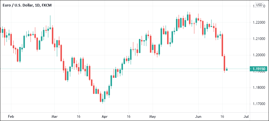
This is the most commonly used forex chart. As the name suggests, price is depicted by a hollow or a filled body. A candlestick chart also has tails or wicks.
When price closes higher than the open, the candlestick chart can turn green or white. It depicts a bullish market. And when price closes lower than the open, the candlestick chart turns red or black. This depicts a bearish market.
Candlestick charts originated in Japan centuries ago. It was introduced to the Western world only a few decades back, by Steve Nison.
The color, tails/wicks represent the market sentiment on the security. Forex traders gain market insights when they learn this chart type.
A unique thing about this chart type is that some candlestick patterns repeat.
These repetitive patterns have a meaning. Some chart patterns include names like:
- Doji
- Bullish or Bearish Harami
- Bullish or Bearish Engulfing
- Pin bars, etc.
You can trade forex using just candlesticks. This is called Price action trading.
Price action trading is nothing but reading price movements and trading. This is made possible by interpreting the colors and the candlestick patterns.
What is a bar chart?
A bar chart, as the name suggests is a series of vertical lines. Each vertical line represents a session or a duration (from the x-axis).
There is also a small horizontal line on the left side of the bar. This represents the opening price. And finally, there is another small horizontal line on the right side of the bar, representing closing prices.
Traders interpret bar charts in a similar way as they read candlesticks. The patterns that you find in candlesticks also apply to a bar chart.
The bar chart requires a bit more practice comparing to its nearest sibling, the candlestick charts. You can use a forex bar chart for plotting trend lines and other forex trading strategies.
The advantage of using bar charts in forex is that because they are just vertical lines, you can see a bit more historical price comparing to forex candlesticks.
What is a line chart?
A line merely tracks and plots the closing prices of a security. It is a continuous line, connecting the closing price from one session to another.
Traders can also use a line chart in forex. But remember that a line chart will not show the open, high, or low.

Traders debate about which price is the most important and fail to agree on this. But when you use technical analysis, most of them will use closing price by default. Hence, there is some validity to using line charts.
Line charts are best used when you see clear trends in the markets. During a trading session, prices can move up or down.
What is an area chart?
An area chart is similar to a line chart, as it also tracks closing prices. The only difference is that an area chart has a filled area underneath the line.
Area charts are commonly used to depict the performance of a security. In the forex markets, an area chart will show you how much the currency pairs have strengthened or weakened.

They are also visually appealing and pleasing to the eye. You will notice many financial news networks and websites use area charts. An area chart is best used when you want to convey the performance of security and nothing more.
Area charts are not ideal for technical analysis.
Other unconventional charts
In the previous section, we covered the most commonly used forex charts. But did you know that there are many other different types of forex charts?
Below is a list of the unconventional chart types you can use in technical analysis.
- Heiken Ashi
- Renko
- Kagi
- Three-line break
- Range bars
- Point and Figure
The above chart types are unconventional because they are not commonly used. But despite not being as popular as the other charts, you can still use them.
When we go deeper into technical analysis, each of these different types of forex chart can convey different meanings.
What is a Heiken Ashi chart?
The Heiken Ashi chart is closely related to candlesticks. This chart type also originated in Japan. They resemble candlesticks very closely.
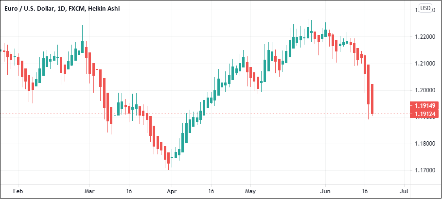
Traders use Heiken Ashi charts because they show trends clearly. This chart type is also a lot smoother comparing to candlesticks.
The Heiken Ashi charts use a modified formula. Hence, they do not show the open/high/low/close in a price.
The regular technical analysis techniques can apply to the Heiken Ashi chart type. But remember that you may have to modify the indicators a bit. This is because Heiken Ashi’s close, is not the actual close of the price.
This holds true for the open price as well.
What is a Renko chart?
A Renko chart is another product of Japan. The word Renko comes from the Japanese word Renga meaning 'brick'. This chart type resembles a stacked brick, rising up or falling down.
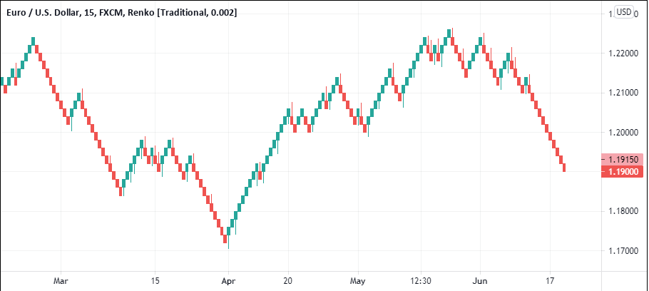
Renko chart is not dependent on time. This is a pure price chart. Traders use the Renko chart as another way to gain market content.
For a Renko chart to work, you will need good tick data. There are also not many charting platforms that offer support for Renko charts. Likewise, there aren't many indicators that work on Renko charts or similar time-independent charts.
Fixed box size is used for Renko. When the price moves up by the specified number of ticks, a new brick forms. For a reversal Renko bar to occur, the price needs to move twice as much.
What is a Kagi chart?
A Kagi chart is also independent of time.
A Kagi chart shows the price movement by plotting a series of vertical lines. The vertical lines represent price movement in one direction.

When there is a reversal, you will see horizontal lines. When reading the Kagi chart from left to right, you will see how the price opened and closed.
Kagi chart is not that commonly used because there is no time period, similar to the Renko chart.
What is a three-line break chart?
The three-line break chart is another price only chart, where the time (x-axis) is not considered.

As the name suggests, a three-line break chart plots opposite line when price moves at least above or below the previous three lines. This gives the trader a great way to view trends in the markets, without any noise.
But because the three-line break chart is independent of time, there are not many indicators you can use with this technique. Tick data once again plays an important role in a three-line break chart.
Because this is not a popular charting technique, there is no native support for this chart type in many forex charting platforms.
What are range bars?
Range bars show the same price increment or decrement. The range bar closes near the high or low. Tick data is important for range bars to work. You can see, the range bar value to a certain number of ticks.
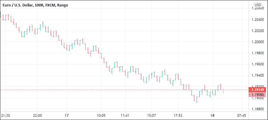
Depending on this value, the range bars then depict price, every time there is an 8-tick movement in the market.
Range bars are similar to Renko bars. The only difference is that Range bars resemble candlesticks while Renko bars are stacked on top of each other.
What is a point and figure chart?
The point and figure chart is the most unique chart type of all. Going by the name, the point and figure chart plot a series of O and X.
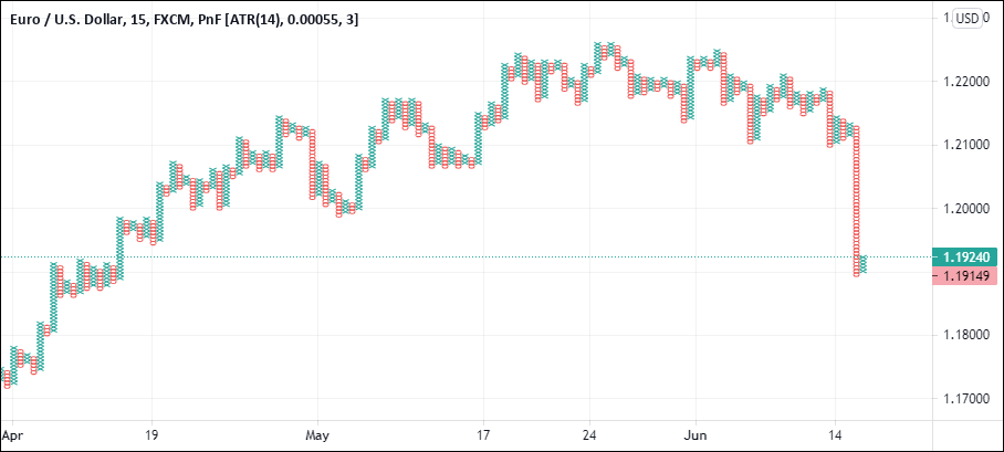
This chart is also known as the PnF chart. X denotes a bullish movement in the market, while O denotes a bearish move in the market. A PnF chart requires a certain value to be set. Then, depending on whether the price moves by a minimum of the value set, the X or O is plotted.
The point and Figure chart work best with support and resistance levels. They are also very good at spotting breakouts in the market.
What chart type should you use in forex?
With so many different chart types, you may be confused by now. But firstly, we should mention that all of these charts can be used in trading. Traders can simply pick a chart type depending on the indicators they use and their trading style.
After all, having too many choices is not that good. So you may wonder what chart type is the best and which one of these can make you money.
Well, firstly it depends on what type of chart you are most comfortable with. No matter which chart you choose, there is always a risk of losing money. Therefore, do not fall into the trap that a particular chart type will make you more money than the other.
If you are a beginner trader in the financial markets, then we recommend you stick with the conventional chart types.
Candlesticks or bar chart is best, to begin with.
Just remember that the success of your trade will depend on which chart you use. Risk is just the same no matter what the trading style is.
As a beginner trader, focus on managing the risk on your trade. This is possible by ensuring that you have a good understanding of the chart you want to use.