
One of the very steps in trading forex is to understand what the charts are telling you. This is one of the fundamental requirements of trading. It holds true across all assets and is not just limited to the forex markets.
Learning to read forex charts, is like learning a new language. However, the way this language of the markets is conveyed is quite different. For the most part, it is all about the visual clues that the market displays. Traders have traditionally used different visual interpretations of the markets. This has led to many different types of forex charts. But regardless of what chart one uses, they convey one and the same meaning.
For someone starting out in trading forex, it is important to understand how to read and interpret the information from the forex charts. This article aims to build a strong foundation on how to read forex charts. By the end of this article, you will gain the ability to identify the different types of forex charts. Furthermore, you should be able to interpret the charts, with a certain confidence level.
Quite often traders jump straight to using forex technical indicators. A trading strategy is no doubt important when trading the financial markets. However, the technical indicators and strategies do not help you much in the long run.
Since the markets merely reflect the investor sentiment, some subjectivity may involve in. This is where human intervention is required when it comes to reading the financial charts. To begin with, let’s take a look at the basics that underline the forex charts.
The basics of reading the forex charts
A forex chart is merely a visual representation of the price of the instrument. This instrument can be anything. From a forex currency pair to an equity index or a commodity.
The forex charts represent the current price is, for the instrument in question.
The financial chart is made up of the x-axis and the y-axis. Price is a function of the y-axis, while time is a function of the x-axis. In simple terms, time is plotted on the x-axis, while the price is plotted on the y-axis.
As time evolves, prices tend to move higher or lower. This is captured on the y-axis.
Depending on the timeframe that you are using, time can be measured in days (for a daily chart), or in minutes (if you are using an intraday chart).
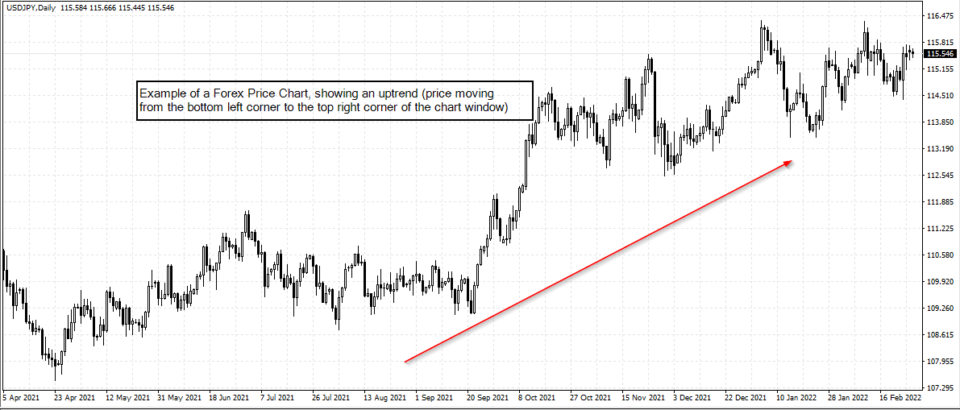
A price chart, as with many languages should be read from left to right. Meaning, that price plots itself continuously, from the left side of the chart to the right. Depending on the direction of the price (whether it is moving higher or lower), traders can then assess the trends in the price chart. When the price is moving from the top left corner to the bottom right corner, it infers that prices are falling over time. This is a downtrend in the market. Conversely, when the price is moving from the bottom left corner to the upper right corner of the chart, it inters that price is in an uptrend.
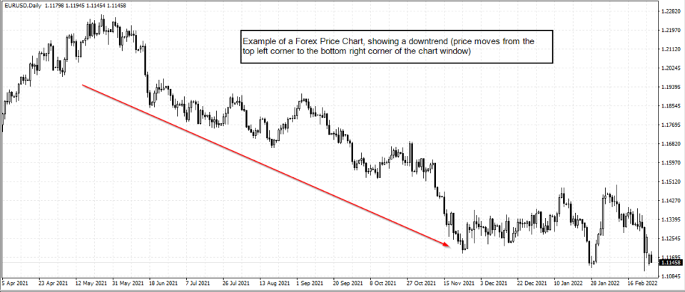
The above chart depicts a very simple and basic price chart. Notice the downtrend, that is depicted, as price from the top left corner to the bottom right corner.
The next chart below shows the opposite, where you have price moving from the bottom left corner to the top right.
What are the different types of forex charts you can use?
When we talk about the forex charts or the financial charts, you will come across one of the below.
A forex chart can be categorized into one of the following:
- Area chart
- Line chart
- Candlestick chart
- Bar chart
The above four types of forex charts are the most common. In addition to the above, there are other chart types as well. These are often called non-traditional charts. Examples of such chart types are:
- Heiken-Ashi charts
- Renko charts
- Range bar charts
- Point and Figure charts
- 3-line break chart
- Kagi charts
In total, we have ten different forex chart types. But, bear in mind that all these chart types, merely represent the same element, which is price. The only difference between these chart types is the way they convey the information.
This is similar to how one would interpret a sentence in a language.
The four main types of forex charts
Let’s quickly take a look at the four main types of forex charts.
What is an Area chart?
An area chart, as the same suggests, plots price and time. However, this plot is based on an area. The area is usually filled. The area chart doesn’t convey much information as far trading is concerned.
Hence, the area chart is more commonly used to just depict the trend in the price.
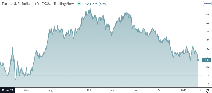
The above example of the forex area chart shows the price of the EURUSD over time.
As you can see, the term area comes from the fact that the area depicting the price is filled. At best, one can merely look at this chart and gauge the trend in the market. The area chart is most commonly used when you want to depict the price trend in the market. It is also one of the most common ways to show prices to a broader audience. Even those without any trading experience can look at the area chart to get an idea of the price.
What is a line chart?
A line chart is very similar to an area chart. The only difference is that the visual representation is shown by the line.
An important aspect to note is that with both the area chart and the line chart, you can only see the closing price. It will not show the open, high, or low prices.
Below is an example of the line chart.

A line chart is one of the three main chart types available on the MT4 trading platform. Traders can also use the line charts to trade. But as mentioned, since this chart only shows the closing prices, you need to be familiar with the markets.
Trends are very visible when trading with the line charts.
What is a candlestick chart?
A candlestick chart is the most popular financial chart for trading. Many traders use candlestick charts because they truly reflect what the market is doing.
The candlestick chart is also one of the main chart types available on the MT4 trading platform.
The candlestick chart represents the open, high, low, and closing prices of the instrument. Depending on which way the market closes, the red or green, or black or white can become the candlestick colour.

The name candlestick comes from the fact that these chart types have wicks with wide bodies, in some ways, looking like a candle.
The candlestick charts are a product of Japan, which was introduced to the West and the broader market only a few decades ago.
If you are adept at reading candlestick charts, you can gain a lot of valuable information. For instance, traders can gauge the sentiment in the market. There are also lots of candlestick patterns that occur repeatedly.
Learning some of the most important candlestick patterns is a trading strategy by itself. The candlestick chart is also widely used for technical analysis and trading strategies.
What is a bar chart?
A bar chart is yet another default chart type available on the MT4 trading platform. The bar chart, as the name infers plots a vertical bar, with two small horizontal lines poking out on the left and the right side.
These depict the opening and closing prices. The highs and lows of the bar chart depict the high and low prices.
A forex bar chart is also one of the commonly used chart types in technical analysis and trading. In some ways, this type of forex chart is visually cleaner to use. Unlike the candlestick chart, you can only see the vertical lines.
One can also colour these charts, similar to the candlestick charts. Therefore, bullish and bearish markets can be represented depending on whether the price closes higher or low, relative to its open.
Introducing other forex chart types
The rest of the forex charts are usually derived from one of the price charts. For example, traders tend to use the Heiken Ashi charts as they depict trends much better.
They look similar to candlestick charts, but the price calculation on the Heiken Ashi chart is somewhat different. Likewise, we have a number of other non-conventional chart types. Forex charts such as Renko charts, or point and figure charts, represent prices completely differently.
A unique feature of such charts is that they do not consider time on the x-axis. Hence, they are often called price-only charts.
Learning to use these charts takes a bit more time. Furthermore, traders should have a firm grasp of the line chart, bar chart, and candlestick chart before venturing into these custom chart types.
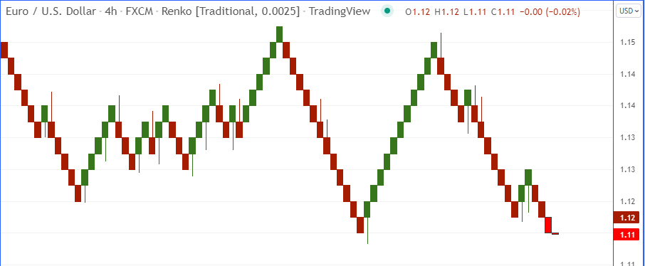
The above chart shows the EURUSD price chart using Renko bars. You can notice how visually different this chart looks, compared to the other traditional chart types we discussed earlier.
The reason why traders look to other chart types instead of the conventional charts is the belief that these unconventional charts can give them an edge.
However, this is far from the truth. Using an unconventional chart type will not give an edge, because it merely reflects price in a different way. It is only the way you interpret prices, that changes.
Common features to all forex charts
No matter what chart type you use, there will be some elements common to all. Therefore, it is essential that traders understand these concepts first.
Price Trends:
Price trends are important as they tell you which way the market is aligned. Thus, by learning to read the price chart, one should be able to understand the market trend.
As mentioned, there are two types of trends, the uptrend, and the downtrend. These trends are easy to spot, regardless of what forex chart type you are using.
Some traders take the help of trend indicators. However, it is always a good practice to understand and read trends without using additional indicators.
Support and resistance:
Support and resistance levels are horizontal levels on the price chart. A lot of price interaction happens at these levels.
Support is like a floor. Price finds support when there is strong buying activity happening at a price level. A bounce from a support level leads to higher prices.
Resistance is the ceiling. Price cannot go any higher above the resistance for the moment. This is where there is a lot of selling activity happening. When the price bounces off resistance, it tends to fall.
Price trends and support/resistance are two elements that you will find across all the chart types. Even the way these two elements of technical analysis are depicted is the same. Hence, whether you use a Renko chart or an area chart, if the trend is down, it will show that prices are falling.
In an uptrend, the price moves higher. You will see that support levels are higher as well. Likewise, in a downtrend, resistance levels tend to be gradually at lower levels.
This is something called higher highs, lower lows for an uptrend, and lower highs and lower lows for a downtrend.
Which forex chart type is better?
If you are just starting out as a trader, then it is best to gain an understanding of the candlestick charts. The concepts one can learn using a candlestick chart can give you valuable experience. You can then use this information to infer the market meaning on any other chart type.
The candlestick charts are also one of the easiest to learn. Having a firm grasp on the candlestick chart can help you to further enhance your technical analysis. Although the line chart looks easy, if you want to trade with it, it can be difficult.
This is where your experience in interpreting the candlestick chart can help. But no matter what forex chart type you use, bear in mind that price trends and support and resistance levels remain a factor, that you should understand.